


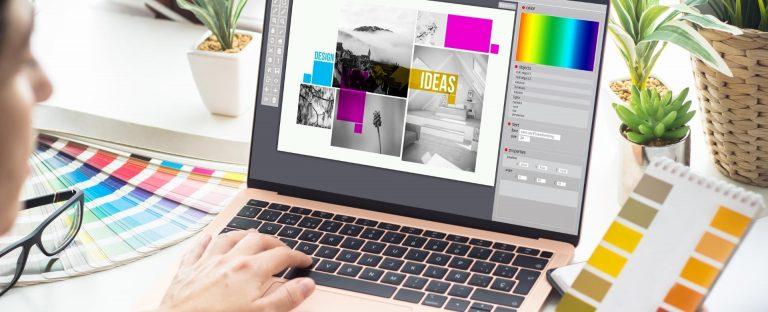
The main responsibility of a graphic designer is to translate an idea into a visual reality. It’s not an easy undertaking, to put it mildly. Graphic designers of all skill levels should understand what works and what doesn’t because more and more companies are looking for cutting edge graphic design for their websites.
Each design serves as a unique canvas on which the designer can iterate, but it never hurts to have a few design pointers to help with the convoluted process. Here are 7 graphic design hints to guide you in creating your next masterpiece.
Using no more than three or four different fonts is considered good design practice. Having a valid cause for doing so does not preclude you from using more, though. There is no absolute prohibition against using five, six, or even twenty distinct typefaces in a single document, but unless the document is carefully designed, it may turn off its target audience.
Despite the fact that we frequently use the terms typeface, font, and typography interchangeably, they have very different meanings. Additionally, being aware of the distinctions makes it simpler for non-designers to connect with designers.
More than 70% of the content that marketers use for marketing includes images, according to 74% of marketers. And the language and picture in these images frequently coexist. The text reinforces the imagery and ensures that the messages are understood, even when the imagery is designed to grab attention and elicit strong feelings.
Typography is the craft of endowing human language with a durable visual form.
― Robert Bringhurst
The text and images are frequently given sole focus while constructing a design.
Allowing space for your design to breathe is one of the characteristics that distinguishes unprofessional designs from professional ones. The regions without images and text are equally significant.
The space around and between design elements is known as “white space,” however it isn’t always white (it can be any color, pattern, or even an image).
One of the most crucial components to making everything work together is being consistent with your design. The reader might be guided by visual components to understand the message or goal of the design. Use the same color schemes, typefaces, alignment methods, and artistic styles throughout whatever you create since consistency grabs people’s attention.
The most crucial details will be covered at the right time in your writing if you create a structure or framework for it.
Additionally, using a framework or structure will help you divide the difficult chore of producing a lengthy article into more digestible chunks.
Before starting a project, take regular pauses, look after your mental health, and get inspiration online. You could feel like you’re squandering time or not trying hard enough, but consider it an investment in your future professional success. Future benefits will outweigh current indulgences.
If they take on every extra job that is presented to them, this can be particularly challenging for young designers.
Every connection you have with clients or potential employers should reflect the brand you are building for yourself. Your sincerity will shine through when you’re at ease with who you are, which will make you seem more sincere and reliable.
Click here to know how Xpansion Design can help.
226091084
| Cookie | Duration | Description |
|---|---|---|
| cookielawinfo-checkbox-analytics | 11 months | This cookie is set by GDPR Cookie Consent plugin. The cookie is used to store the user consent for the cookies in the category "Analytics". |
| cookielawinfo-checkbox-functional | 11 months | The cookie is set by GDPR cookie consent to record the user consent for the cookies in the category "Functional". |
| cookielawinfo-checkbox-necessary | 11 months | This cookie is set by GDPR Cookie Consent plugin. The cookies is used to store the user consent for the cookies in the category "Necessary". |
| cookielawinfo-checkbox-others | 11 months | This cookie is set by GDPR Cookie Consent plugin. The cookie is used to store the user consent for the cookies in the category "Other. |
| cookielawinfo-checkbox-performance | 11 months | This cookie is set by GDPR Cookie Consent plugin. The cookie is used to store the user consent for the cookies in the category "Performance". |
| viewed_cookie_policy | 11 months | The cookie is set by the GDPR Cookie Consent plugin and is used to store whether or not user has consented to the use of cookies. It does not store any personal data. |